

C2S designs and builds custom software solutions that are tailored to your business needs. We use the latest AI technologies and best practices to ensure that your software is efficient, secure, and easy to use.
We streamline your business processes and turn ideas and hunches into reality. Our proven track record of successful projects speaks for itself.
Our expertise is in web applications that run on Microsoft Azure. We can take your idea, rapidly prototype it, and then build it to your exact specifications, in days not months.
Our in-house design team will work with you to create a beautiful, user-friendly interface that is easy to use and navigate. Our passion for UX removes clicks and makes sure your users can find what they need quickly and easily.
Are you an existing client and need assistance? We're here to help. Fill out the form below and our team will get back to you.


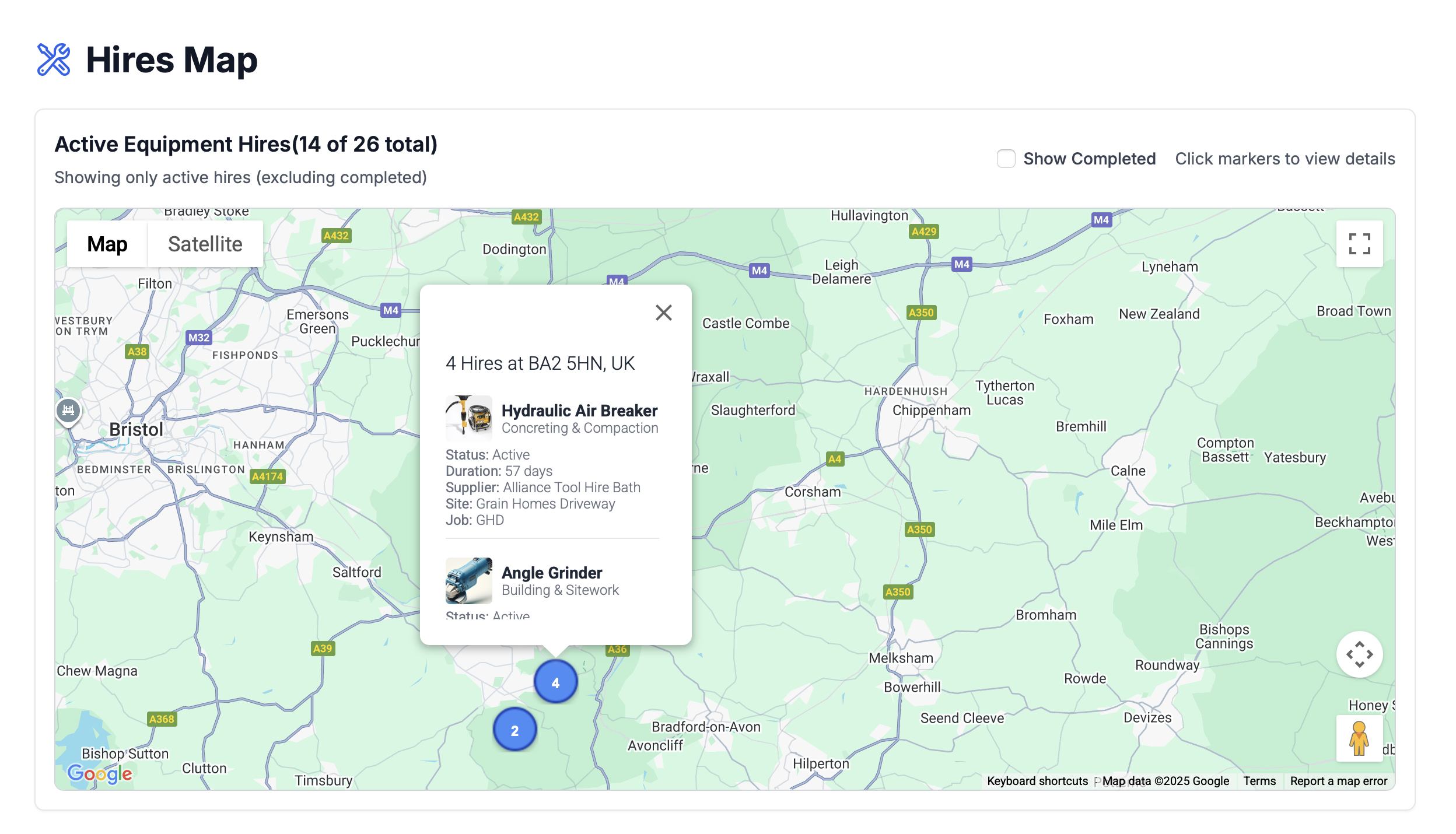
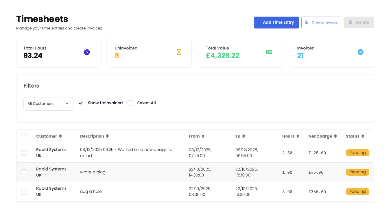
Planted is cloud-based web SaaS application that allows construction companies to manage their hire equipment and tools. It visually shows what's on hire, where it is and when it's due back.
Planted is written in React, hosted in Azure with a PostgreSQL backend. This feature-rich SaaS took 2 weeks to write, predominantly coded by AI.


We are the founders of Zahara, the accounts payable automation solution used by scale-up SMEs. Zahara is a cloud-based solution that streamlines the payable process with advanced automations.
We built the first version of Zahara in 2017 before it spun out into a separate company and went global. This SaaS application is used by 10,000 active weekly users.
We focus on web and cloud-based applications, internal tools, automation workflows, and line-of-business systems. From small utilities to full SaaS products, we can design and build solutions that fit your specific needs.
Using modern tooling and AI-assisted development, we can often produce a working clickable prototype in days rather than months. This lets you validate ideas early before committing to full build-out.
Yes. We typically deploy to Microsoft Azure and can handle infrastructure, monitoring, backups, and ongoing updates so you don’t have to worry about the technical side of hosting.
We have deep experience integrating with finance systems such as Sage and Xero, as well as document management platforms. We’ll work with your existing stack rather than forcing you to start again.
We’ll guide you through a light-touch, structured process. You stay involved for key workshops, feedback, and sign-offs, while we handle the day-to-day detail of design, build, and testing.
Yes. We can wrap, extend, or gradually replace legacy systems with modern, cloud-based components so you can move forward without a risky “big bang” replacement.
Security and privacy are designed in from day one. We follow best practices around authentication, access control, encryption, and audit trails, and align to your compliance requirements.
The easiest way to start is with a short discovery call. We’ll understand your idea or problem, suggest options, and outline an initial approach, timeline, and investment so you can make an informed decision.
Get in touch with us to discuss your project or learn more about our services.
C2S is Click2Scan Ltd, a company that started in 2007 selling document scanners. We quickly moved onto selling document management software with applications like FileDirector and ABBYY FlexiCapture being core to our solutions.
We acquired a deep knowledge of finance software and in particular, accounts payables. As big consumers of paper, this office function was perfect for automation. Eventually we created our own solution, Zahara which spun out of Click2Scan.
Nearly two decades on we are still supporting our customer base of FileDirector and FlexiCapture customers as well as writing software for ourselves and other customers.
We are the people that can take your idea for a software tool and turn it into a reality, quickly. Software not only needs to work, it needs to be hosted and maintained. It needs to be secured. Although it's never been easier to write software, it's still a daunting proposition for someone without any experience.
It could be a utility tool for streamlining a process or an automation that will save you countless hours. Using the latest AI tools, we will work to understand your project, evaluate the best technologies and create your application in the most efficient way.
And we aren't frightened by mobile applications like some. We can create web apps or mobile apps running on iOS and Android. We also have a network of friends we have acquired over the years who have different disciplines and expertise that we can tap into.